Why Windows feels harsh after a few hours
You sit down feeling fine, then a few hours later your eyes feel “scratchy,” the screen looks too bright, and small text starts to shimmer. That harshness usually isn’t one single setting—it’s the mix of a bright backlight, a room that’s dimmer than the screen, lots of white backgrounds, and text edges that don’t quite look steady at your viewing distance. Windows can also default to scaling and font rendering that’s technically correct but uncomfortable for your particular monitor. The tricky part is that the “fix” can backfire: turning brightness way down or cranking warm filters too far can make you squint more.
Most people chase the wrong lever first. They change a theme, install a blue-light app, or blame the monitor, but the strain often comes from simple mismatches: your screen is brighter than your surroundings, your text is slightly too small, or you’re reading high-contrast black-on-white all day without breaks. The goal isn’t to make everything dim; it’s to make the display easy to focus on without your eyes constantly re-adjusting. A few targeted adjustments—done in a sensible order—usually beat any “one-click” solution, but it does take 10–15 minutes to dial in and a day or two to judge the result.
Start with brightness, contrast, and your room lighting
The fastest relief usually comes from matching the screen to the room. If you work in a dim space with the monitor set to “showroom” brightness, your eyes keep tightening and relaxing all day. Turn on the room light you actually use at night, open a mostly white page, then lower your monitor brightness until it no longer looks like a light source. If your monitor has an “Eco” or “Reading” preset, start there, then fine-tune. In Windows, use Settings > System > Display to disable auto-brightness or adaptive brightness if it keeps shifting on you.
Keep contrast moderate. Extreme contrast (pure white backgrounds, deep blacks, and overly “vivid” modes) makes edges feel harsher, especially on cheaper panels. If you have HDR on and you’re not watching HDR video, turn it off—HDR can raise overall brightness and make white pages unpleasant. The constraint: you’ll need a couple of days to settle on a brightness that still works for sunny afternoons.
Make text easier: scaling, resolution, and ClearType
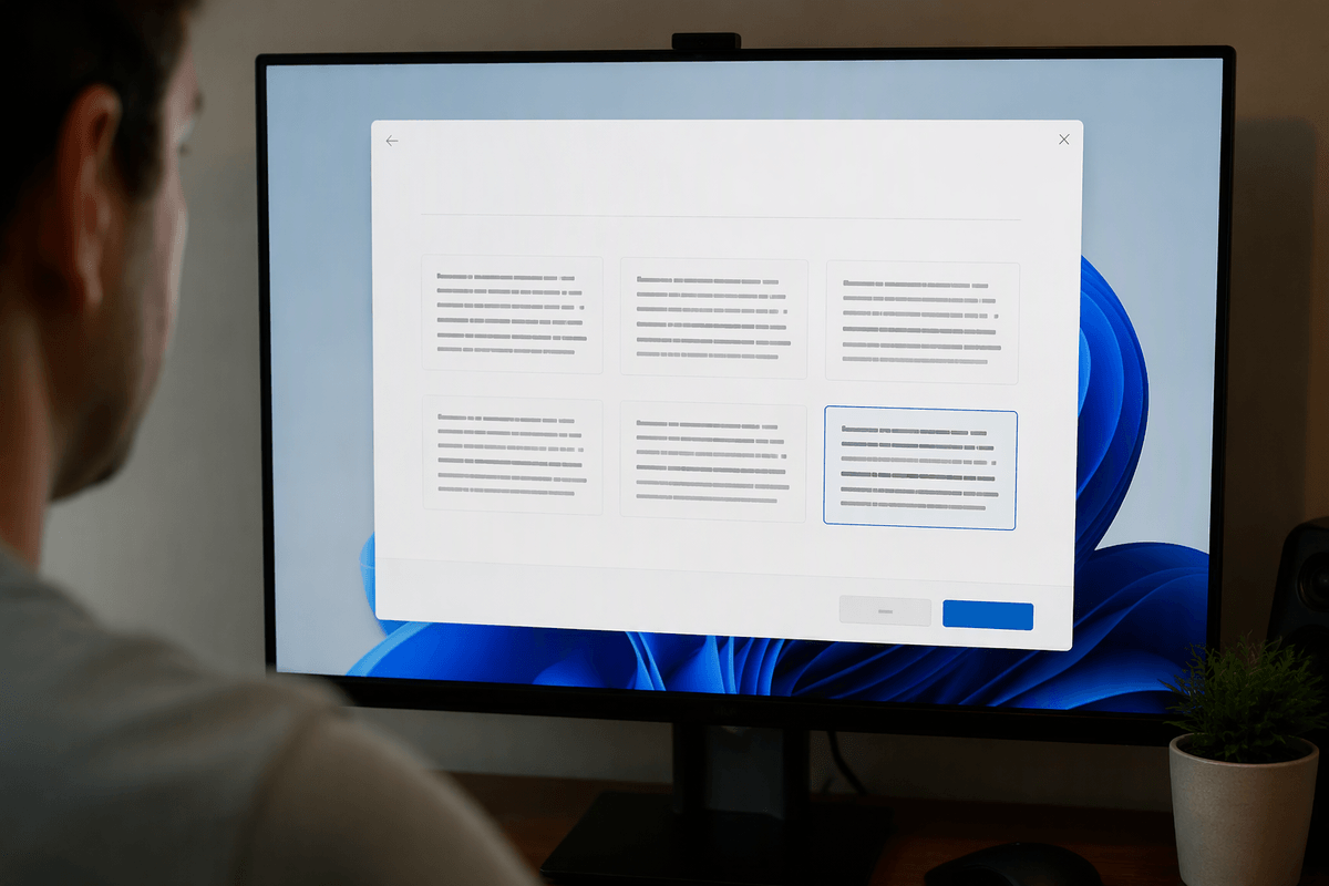
If you lean in to read, or if letters look like they have tiny shadows, don’t fight it with brightness—make the text physically easier to resolve. In Settings > System > Display, keep your monitor on its “Recommended” resolution first. Dropping resolution can make text look bigger, but it also blurs edges and creates that shimmering effect. Use Scale instead (try 110–125% on a 24–27" display). The trade-off is that some older apps may look slightly soft or have cramped layouts, so change one step at a time and live with it for a day.
Then run ClearType: search “Adjust ClearType text,” enable it, and pick the samples that look darkest and steadiest, not the thinnest. If you use more than one monitor, repeat the setup for each—ClearType and scaling can feel “right” on one screen and wrong on another. Also consider bumping text-only size in Settings > Accessibility > Text size if your UI is fine but reading is tiring.
Reduce blue light and harsh whites without muddy colors
If white pages feel like a flashlight, warm the screen gradually instead of “going orange.” In Settings > System > Display, turn on Night light and start around 10–20 strength, then schedule it for evenings when your room is darker. Push it too far and you’ll lose color cues (spreadsheets, photos, even link colors), which can make you stare longer and defeat the point. If your monitor has a Low Blue Light/Reading mode, compare it to Night light—use one or the other, not both stacked.
For harsh whites during the day, aim for “off-white” rather than dim. Many monitors let you lower color temperature slightly (e.g., from 6500K toward 5800K) without tinting everything. Also turn off “Vivid,” “Dynamic Contrast,” or “Enhancer” features; they often pump whites and sharpen edges in a way that feels crisp for five minutes and tiring for five hours.
Choose themes that stay readable: dark mode, light mode, contrast
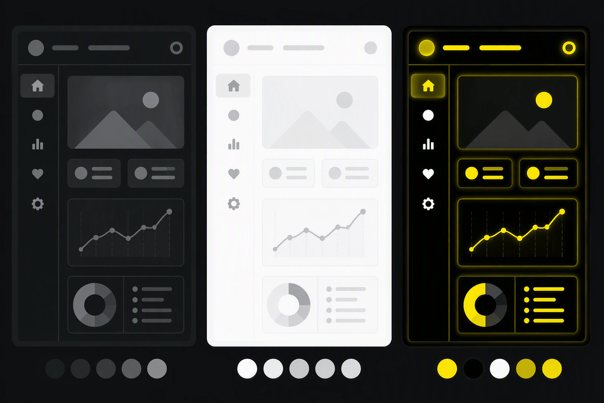
Theme choice matters most when you’re staring at big blocks of white all day. Dark mode can feel immediately calmer, but it isn’t automatically easier to read—thin fonts on a pure-black background can “glow” and look fuzzy, especially on lower-quality panels. If you try dark mode, use a dark gray background (not true black), and make sure text is a clean off-white. In Windows, go to Settings > Personalization > Colors and try “Custom” so you can keep Windows surfaces dark while leaving app content (like documents) light if that reads better.
Light mode is often clearer for long reading, but only if you tame the white. Pair it with your earlier brightness/Night light settings, and avoid high-contrast black-on-white when your room is dim. Save High Contrast themes for when you truly need them (low vision, glare you can’t control), because they can break some websites and make icons look odd. The practical test is simple: pick one theme, then read a full page without wanting to squint.
Tame browser and app glare: pages, PDFs, and code editors
The biggest “glare” problem usually isn’t Windows—it’s the content. Browsers love bright white pages, and a single PDF with a white margin can feel harsher than your whole desktop. In your browser, enable its built-in dark theme and use a reader view for articles when possible, but don’t force-dark everything if it makes text look fuzzy or colors misleading. If you live in Google Docs or Office online, lower the page brightness by switching the document page to a light gray (when available) and keep zoom slightly higher so you’re not squinting at thin strokes.
For PDFs, use the app’s comfort options: many readers let you change page background and text color, or offer a “night” mode that keeps text crisp without turning the whole screen orange. In code editors, pick a theme with a dark gray background and avoid neon syntax colors. The constraint is time: each app has its own settings, and you’ll likely need 15–30 minutes to tune your main two or three tools.
Check the physical setup: distance, height, and monitor behavior
If you’ve tuned Windows and pages still feel sharp, look at how your eyes meet the screen. Most people sit too close and too low, which turns small focus errors into strain. A good starting point is an arm’s length away, with the top of the screen around eye level so your gaze naturally angles slightly downward. If you’re on a laptop, a stand plus an external keyboard is often the cheapest comfort upgrade—otherwise you end up choosing between neck tension and squinting.
Then check the monitor’s behavior. Disable any “dynamic contrast,” “super resolution,” or motion enhancement features in the monitor menu; they can add edge sharpening and brightness pumping that feels like glare even at normal settings. If you notice flicker-like fatigue, try turning off monitor “Eco” dimming, set the refresh rate to the highest available in Settings > System > Display > Advanced display, and avoid running brightness extremely low on monitors that use PWM. The limitation: not every panel is stable at low brightness, so you may need a small desk lamp to keep the screen comfortable.
Build habits that keep the improvements working
You’ll keep the comfort gains by treating them like defaults, not a one-time tune-up. Save a couple of “known good” setups: one for daytime (brighter room, less Night light) and one for evenings (slightly warmer, slightly dimmer). Then stick to a simple rhythm—every 20 minutes, look across the room for 20 seconds, and blink on purpose when you notice yourself staring. If you work long sessions, schedule a short walk or water break every hour.
Watch for drift. Auto-updates, new monitors, and even moving desks can throw things off, so recheck brightness and scaling when something changes. The practical cost is consistency: it takes a week of small adjustments to find settings you stop thinking about.